Bag Balm Redesign
Brand Identity | Package Design | Social
Project
Mock brand redesign for heritage-brand skincare product, Bag Balm, creates a fresh visual identity, without stepping on the iconic brand.

Background
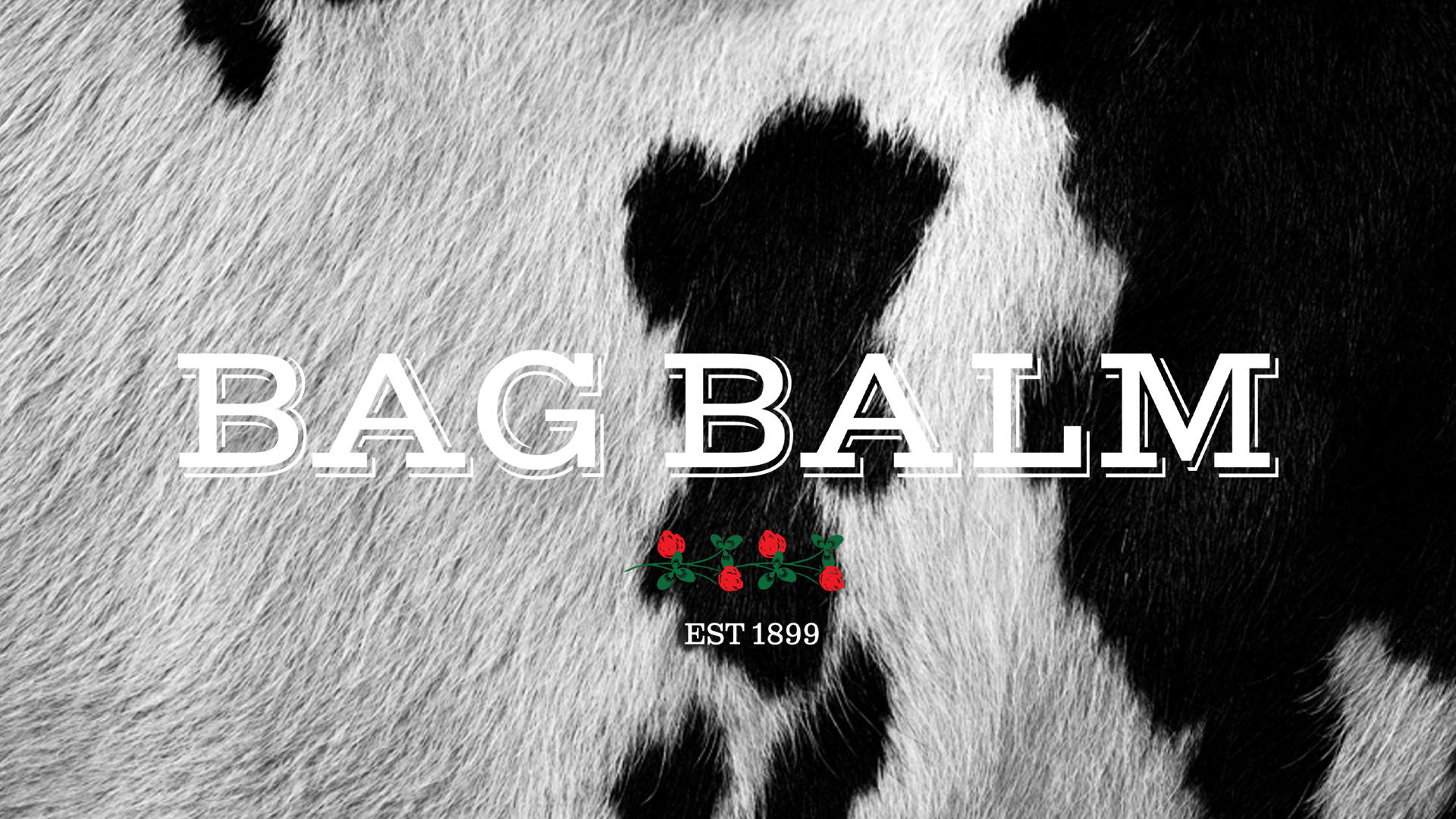
Bag Balm, a skin moisturizer since 1899, was originally developed for Vermont dairy farmers to treat irritated cow udders from harsh winters. Packaging is a green square tin, with renderings of a cow’s head and Vermont’s indigenous red clover.
Approach
Current tin package design is text heavy with low contrast visuals, which to some consumers conveys a medicinal product. The redesign creates a visual identity to better represent product use, without stepping on the iconic brand. Store shelf visibility and online presence/advertising are addressed.
Package Redesign
Updated color palette to increase store shelf visibility. Color options: brightened Bag Balm classic green and yellow.
Updated logo.
Updated illustrations, typography, and patterns.


Campaign, Social, and Website
Drawing on product-heritage design traits, fresh and inviting visuals and animations recast the iconic cow, the tin package, and Vermont’s indigenous red clover flower. Product poster designs reference Bag Balm’s original 1920s print ads.